Tuesday, September 30, 2008

Warp Patch for Quartz Composer

Warp Patch for Quartz Composer

Intended primarily for fulldome projection using a spherical mirror
Also used as a navigable movie player
Modelled after the warpplayer application

Written by Christopher Wright @ Kineme
Design by Paul Bourke


The Quartz Composer patch discussed here warps an image (or movie) in an arbitrary way as specified by a user generated mesh stored in a simple text file. There are many potential applications for this but the motivation for this capability arose from a very precise requirement, namely the warping of images for projection into immersive spaces by using a projector and a spherical mirror.

This document assumes the reader is familiar with the topics listed above, namely the use of a spherical mirror as a low cost single projector solution for immersive displays. And that this technique requires image warping such that the result appears correct on the final surface. Additionally, the concept of navigable movies ... movies where each frame consists of more than a limited perspective projection and the viewer may change his/her view while the movie plays.

In all the above applications an image is warped (distorted) using a regular mesh consisting of vertex coordinates (x,y), texture coordinates (u,v) and an intensity mapping (i). The patch described here adds this warping support to Quartz Composer and is a direct analog to the existing stand alone application "warpplayer" (it uses the exact same warp mesh file format) except that it adds the enormous additional functionality of Quartz Composer to create more dynamic/interactive experiences. The rest of this document will concentrate on applications intended by the original designer of the patch, every attempt has been made to keep it general so that hopefully other uses will rise.

Description of inputs

  • Mesh file: file name of ascii warp mesh, if the file name starts with "/" then it is an absolute file path, if it starts with a "~" then it is relative to the users home directory, otherwise relative to the current Quartz Composition directory. For portability reasons the last option is usually the preferred one.

  • Texture control u, v: either clamp or wrap.

  • X,Y,Z position: provided for generality, not used for the purposes discussed here.

  • Width, Height: this controls the width and height of the panel the image/movie is displayed on. For the purposes discussed here one is always running in full screen mode, for the image/movie to fill the frame the width and height should be the inverse of the aspect ratio. So for 4:3 aspect the width and height should be 0.75, for 16:9 it should be 0.5625.

  • Delta u,v: These modify the mesh texture coordinates of the warping mesh. Not all adjustments make sense, the most common for panoramic images/movies is to map the mouse movement to the delta u input to enable horizontal panning.

  • Theta: This also modifies the texture coordinates of the warping mesh. For the applications discussed here it is mostly used for rotating a fisheye projection for planetarium content.

  • Image: This is the input port for the image (or movie).

Macworld | Mac OS X Hints | Gain full keyboard and mouse control in 10.5’s screen sharing

Macworld | Mac OS X Hints | Gain full keyboard and mouse control in 10.5’s screen sharing

...One final frustration is that when using screen sharing in something less than full-screen mode, the cursor isn’t bound to the screen sharing window, leading to accidental mouse clicks that take me out of the remote Mac and back to my local Mac.

As it turns out, there’s a simple way to fix all of these frustrations. By combining screen sharing with teleport, a free program (donations accepted) that is generally used to share one keyboard and mouse with several Macs, you’ll solve all of these problems in one step.

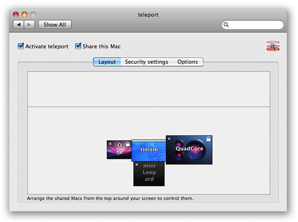
Teleport is basically a virtual keyboard/mouse switch box, designed for environments where you have several machines in close proximity. Using teleport, you can send all keyboard and mouse activity to any other Mac, just by dragging the mouse cursor off a designated screen edge on the “master” Mac. For instance, here’s what the setup looks like for a four-machine lab; the “master” machine is in the middle, and control of the keyboard and mouse is transferred to the other machines by simply dragging the cursor to that particular edge of the screen. (You transfer control back by dragging the mouse to the corresponding screen edge on the machine you’re controlling.)

image

If you have such a setup, you can then remove the keyboards and mice from all but one machine, and just use teleport when you need to control the other machines. But there’s nothing about teleport that requires the machines to be sitting next to each other—it’s just that, if used alone, you really need to be able to see the monitor of the remote Macs in order to see what’s happening. And that’s where screen sharing enters the picture. By combining screen sharing and teleport, you get the best of both worlds: screen sharing lets you see what’s happening on a Mac’s screen that’s not right next to you, and teleport sends all mouse and keyboard activity to that machine.

Dabbleboard - Online whiteboard for drawing & team collaboration

Dabbleboard - Online whiteboard for drawing & team collaboration

Saturday, September 27, 2008

Friday, September 26, 2008

Art Review - 'Second Lives' - The Opening Show of the New Museum of Arts and Design Uses Old Materials to Present a New Face - Review - NYTimes.com

The Opening Show of the New Museum of Arts and Design Uses Old Materials to Present a New Face - Review - NYTimes.com

Hiroko Masuike for The New York Times

The Museum of Arts and Design’s first exhibitions at 2 Columbus Circle, “Second Lives” (including Jean Shin’s “Sound Wave,” above), “Permanently Mad” and “Elegant Armor,” open Saturday. The shows, Roberta Smith writes, reflect an institution “wild with delight” at having a building of its own. More Photos >

Published: September 25, 2008

Museum of Arts and Design.”

Thursday, September 25, 2008

How to make your own rollup with google reader.

This is one of those posts where I explain something to myself that ought to be simple but wasn't.

To create and publish an aggregation of many blog feeds you can just
  1. put them all under a reader folder
    (click manage subscriptions bottom right of your reader.google.com page)
  2. make that folder public
    (click Settings, Folders and Tags
    --select the Folder in question
    --use the dropdown to make that folder public
    --click View Public page
    for example,
In reader, you can also tag items. You can use Step 2 above to publish tags just as you did Folders. This will create a page of items that you have given a specific tag.
For example, http://www.google.com/reader/shared/user/15578203462828253660/label/SIC


Of course, now you have two different pages. Suppose you want a single page that combines items you have tagged with other feeds?
  1. subscribe to your own blog's published sub-feed of tagged items,
    (for example http://jonschull.blogspot.com/search/label/SIC )
  2. and put that sub-feed in a folder you have published
    (the aforementioned http://www.google.com/reader/shared/user/15578203462828253660/label/SIC )

And suppose you want to publish only some items from a friend's feed? Either
  • manually tag them with a tag you are publishing
  • have the friend tag them in a specific way, and put the friend's sub-feed in a folder you are publishing
And suppose you want a quick way of adding your own items to one of those public pages?
  • Make a note (click Notes under Your Stuff, top left in Reader)
  • Find it in your Notes and give it the tag you want.
  • the notes bookmarklet looks helpful here too
But beware: it doesn't look like you can unpublish notes. There may be other gotchas. I may be confused.

Matroshka Compact Living Concept: Your Life in 43 Square Feet : TreeHugger

Matroshka Compact Living Concept: Your Life in 43 Square Feet : TreeHugger
by Collin Dunn, Corvallis, OR, USA on 03.10.08

Matroshka: compact living concept, compacted

Like its namesake, there's more to the Matroshka (meaning "grandmother" in Russian; also used to describe those fun dolls that fit into each other) compact living system than meets the eye. Containing an L-shaped sofa, double bed, dinner table, four stools, total seating for 12, home office workspace, wardrobe and a bunch of storage, Matroshka is a compact living space's dream come true; in its most compact form, it takes up just about 13 43 square feet (4 square meters).

It might not be quite as dramatic as Casulo -- the amazing concept that fits an armoire, a desk, a height-adjustable stool, two more stools, a six-shelf bookcase, and a bed with a mattress into a box -- but its arguably more flexible; you could furnish a studio or one-bedroom apartment with little else, and even host a good-sized dinner party. Hop below the fold for more info and to see Matroshka's neat tricks. ::Matroshka via ::NotCot.org

Matroshka: compact living concept, unpacking

First unveiled at the Stockholm Furniture Fair last month, Matroshka was born from a project in a course on creative thinking at Mid Sweden University last May. In an attempt to find new solutions for people living in small spaces, the four industrial design students considered how to best create space, storage and sociality.

Matroshka: compact living concept, dining set up

By thinking of the room in terms of volume rather than just square footage, they were able to get lots of utility from just a few objects and even less space; every bit of empty space was considered, and almost all of it serves at least one purpose. It's quite remarkable to think you could (cozily) entertain up to 12 people in such a compact space, and it's a great example of how less can really be more. They're currently looking for ways to turn Matroshka from dream to reality; for now, you can see it on display at Paizano Design in Sundsvall, Sweden.

Matroshka: compact living concept, living room set up

Matroshka: compact living concept, bed set up

Hanging and Movable Walls


Creform


CREFORM®


Carpooling apps

I think a geo-twitter service like twinkle may be the right platform for ride sharing / car pooling, but here's the competition....

Startups That Are Reinventing Carpooling on the Web

As gas prices have soared, more commuters have made the switch to carpooling, and they’re turning to a host of free web-based services – from government-sponsored transit programs to iPhone apps and widgets — to meet their needs. But the plethora of options can be a mixed blessing: More options mean your perfect carpool match is more likely to be signed up with a different service. That’s not only a problem for you, the commuter, but also for the companies hoping to capture your business; to succeed, ride-match sites have to be able to guarantee that they can get riders where they want to go, when they want to go there.

So a growing number of ride-share startups are following in the footsteps of other Web 2.0 applications providers by targeting the enterprise market. Catering to businesses gives Carpool 2.0 startups both a captive pool of riders with a shared destination (and often similar schedules) and corporate execs that are increasingly willing to pay for customized services, like hosted web sites and mobile apps.

Wednesday, September 24, 2008

80/20 Outside of the Box Solutions

80/20 Outside of the Box Solutions


More picks from their catalogs:
http://jsdesktopg5.rit.edu/~jonschull/stuff/80-20/tableWithCost.jpghttp://jsdesktopg5.rit.edu/~jonschull/stuff/80-20/profiles.jpg

http://jsdesktopg5.rit.edu/~jonschull/stuff/80-20/ExpandableTable.jpg

hugin - Panorama photo stitcher

hugin - Panorama photo stitcher: "hugin - Panorama photo stitcher

hugin - Panorama photo stitcher

Goal: an easy to use cross-platform panoramic imaging toolchain based on Panorama Tools.

With hugin you can assemble a mosaic of photographs into a complete immersive panorama, stitch any series of overlapping pictures and much more.

screenshot

Architecture Review - Renzo Piano’s California Academy of Sciences Blooms and Grows, Balancing Man and Nature - Review - NYTimes.com

Architecture Review - Renzo Piano’s California Academy of Sciences Blooms and Grows, Balancing Man and Nature - Review - NYTimes.com

Architecture Review

A Building That Blooms and Grows, Balancing Nature and Civilization

Tim Griffith

The new California Academy of Sciences is capped by two spheres covered with plants. More Photos
By NICOLAI OUROUSSOFF
Published: September 23, 2008


Ecoshack: Projects

Ecoshack: Projects

Green Event Tents (GETs)
Ecoshack's next product line
available 2008 - 2009
Contact us for more info


"From Cubicle to Commune"
Urbantine/Tent UK competition
(2007)
More...

A-Z

A-Z


andrea zittel's a-z

an institute of investigative living:

The A-Z enterprise encompasses all aspects of day to day living. Home furniture, clothing, food all become the sites of investigation in an ongoing endeavor to better understand human nature and the social construction of needs.

Tuesday, September 23, 2008

A R T D E S I R E: The most popular S-curve

A R T D E S I R E: The most popular S-curve

o

iPhone Document Scanner - buy custom personalized products from Ponoko

iPhone Document Scanner - buy custom personalized products from Ponoko: "iPhone Document Scanner Download free .eps file now ›

iPhone Document Scanner
Add a new design

NOmadeDESIGN

NOmadeDESIGN


Copy Pictures from Flickr to Picasa Web Albums (or vice-versa) - Digital Inspiration

Copy Pictures from Flickr to Picasa Web Albums (or vice-versa) - Digital Inspiration

Upload flickr to picasa When it comes to sharing digital photos online - Flickr Photos, Google Picasa Web Albums and Zooomr rule the web. And now a free tool called Migratr has created sort of a "virtual bridge" between these photo services.

Migratr is a no-frills Windows utility that allows you to bulk move copy photographs from one picture sharing service to another effortlessly using your hard drive as a temporary storage.

You select a source (like Flickr, Picasa) and every picture from your account is downloaded locally. The next half of the cycle will upload them to the destination. All the important information including picture title, description and tags are preserved during the transition.

upload flickr to picasa